![]() Healthcare
Healthcare
In the demanding healthcare landscape, effective staff rostering is paramount. It's a delicate balance: providing exceptional patient care while supporting the wellbeing of your valuable staff. But traditional rostering methods often fall short, leading to inefficiencies, communication breakdowns, and
![]() SMS
SMS
The year's final three months are one of the busiest shopping seasons worldwide, known to retailers as
![]() Black Friday
Black Friday
During Black Friday 2023, consumers around the world spent a record-setting $US4.1 billion with retail
![]() Black Friday
Black Friday
This is an exciting time of year for shoppers with many looking to grab the best deals and others planning
![]() SMS
SMS
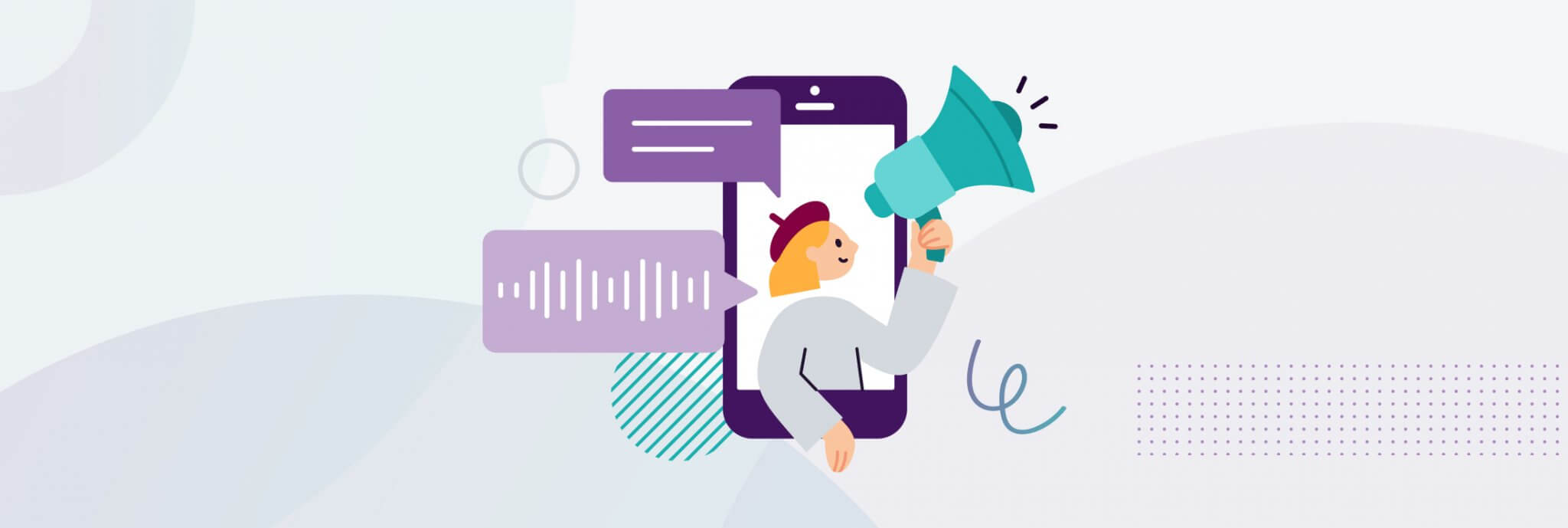
Two channels which marketers often find themselves having to choose between are SMS and email. Both can
![]() SMS Marketing
SMS Marketing
With an open rate of 98%, a delivery speed of five seconds, and messages typically opened within 90 seconds,
![]() RCS
RCS
Esendex is ready for RCS messaging when Australia’s networks are.
RCS (Rich communications
![]() SMS
SMS
SMS has become a go-to marketing tool in recent years – and there’s no sign of its popularity diminishing
![]() How to:
How to:
SMS Surveys can help you engage your customers and staff, gather instant feedback, improve customer experience
![]() How to:
How to:
SMS is one of the most immediate and direct marketing channels there is, and personalised SMS brings
 Healthcare